Buttons are a fundamental part of any interface, providing users with the means to interact with digital products. However, what happens when these buttons become disabled? While this may seem like a small issue, it can have a significant impact on user experience and usability. In this blog post, we’ll explore the pitfalls of disabled buttons and how to avoid them. If you want your website or application to be accessible and intuitive for all users, keep reading!
How Users Deal With Disabled Interfaces
When buttons are disabled, it can be frustrating for users who may not understand why they’re unable to interact with the interface. Depending on how large a portion of the interface is disabled, users may feel as though the entire system has crashed or broken down. In some cases, this can lead to user abandonment and lost conversions.
On the other hand, if only a single button is disabled while others remain active, it can cause confusion over which actions are available and which aren’t. Users may try repeatedly clicking on the inactive button in hopes that it will eventually work. This creates an unnecessary burden for users and undermines their confidence in your platform.
Ultimately, when dealing with disabled interfaces or buttons disability issues, it’s important to keep users informed about what’s happening at all times. Clear communication through appropriate feedback mechanisms can help prevent frustration and ensure that users always know how to proceed.
WHEN LARGE PARTS OF THE INTERFACE ARE DISABLED
When large parts of the interface are disabled, users can easily get confused and frustrated. They may not understand why certain elements appear to be unresponsive, which could lead to them giving up on the task altogether.
One common mistake when disabling large portions of an interface is not providing clear feedback. Users need to know what’s happening and why certain elements are unavailable. It’s important to communicate this information in a way that is easy for them to understand.
Another issue that can arise from disabling large parts of an interface is creating a lack of context. If too many elements are disabled at once, users may have trouble understanding how they all relate to each other and what their purpose is within the overall system.
To avoid these pitfalls, designers should consider breaking down tasks into smaller steps whenever possible. This allows for more targeted disablement and clearer feedback along the way.
Additionally, it’s crucial to provide alternative paths or options for users who cannot complete a task due to disability limitations. By offering different methods or tools, you ensure that all users have equal access and opportunity within your system.
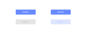
WHEN ONLY A SINGLE BUTTON IS DISABLED
When designing interfaces, sometimes it’s necessary to disable certain buttons or options. However, when only a single button disabled, users can become confused and frustrated.
Imagine you’re filling out a form online and you reach the end, but the “submit” button grayed out and unclickable. You may wonder if there are errors in your submission or if there’s something else preventing you from submitting the form.
One solution to this problem to provide clear feedback as to why the button disabled. For example, instead of just graying out the button, add text that explains what needs to done before the button becomes clickable again.
Another solution is to avoid disabling individual buttons whenever possible. Instead of disabling a submit button for incomplete forms, consider using inline validation techniques that alert users of any missing or incorrect information as they fill out each field.
By being mindful of how we design our user interfaces and providing clear feedback for any disabled elements, we can create more intuitive experiences for our users.
Inline Validation Is Never Bulletproof
Inline validation can be an effective way to guide users towards inputting the correct information. However, it is important to remember that inline validation is never bulletproof. It can still leave room for errors and confusion.
For example, inline validation often relies on a user’s ability to interpret error messages correctly. If these messages are unclear or vague, they may not help the user understand what went wrong with their input.
Furthermore, inline validation cannot account for every possible mistake a user might make. For instance, if a form requires a phone number but does not specify which format required (e.g. parentheses around area code), then some users may enter the number incorrectly even if inline validation is in place.
While inline validation can helpful in guiding users towards correct input, it should not relied upon as the sole means of ensuring accurate data entry. Developers should take care to create clear and specific error messages and provide guidance where necessary so that users have all the information they need to complete forms accurately without relying solely on inline validation.
Inline Validation Is Never Bulletproof
Inline validation a popular technique used to help users fill out forms correctly. It provides real-time feedback on the accuracy of the information entered by the user. However, inline validation is never bulletproof.
One of the main challenges with inline validation is that it relies heavily on JavaScript. If JavaScript disabled in a user’s browser, then inline validation will not work as intended. This means that users who rely on screen readers or other assistive technology may struggle to use forms with inline validation.
Another challenge with inline validation is that it can be difficult to determine what types of errors should trigger an error message. For example, should a missing field trigger an error message immediately? Or should the form wait until all required fields have completed before displaying an error?
Furthermore, even if you’ve identified all possible errors and implemented them into your form’s design, there still potential pitfalls like false positives (errors occurring no mistakes made) and false negatives (no alerts despite input issues).
While inline validation can be helpful in improving usability for some users filling out online forms quickly, its limitations mean it cannot always provide optimal solutions for every end-user without encountering several drawbacks along the way.
When Disabled Buttons (And States) Work Well
There are some scenarios where disabled buttons and states can actually work well for the user. One such example when a form has multiple steps, and the next button disabled until all required fields on the current page have completed correctly. This helps prevent users from moving forward before they’ve completed everything necessary to move onto the next step.
Another scenario where disabled buttons work well when there’s a limit to how many times an action can taken in a certain time period (such as submitting a form or voting on something). By disabling the button after used once, it prevents users from accidentally clicking it again and wasting their limited opportunities.
Disabled states can also be useful for preventing errors or confusion. For instance, if a user clicks “submit” on an online purchase but their credit card information entered incorrectly, disabling the submit button and displaying an error message prevents them from accidentally placing an order with incorrect payment information.
While disabled buttons can sometimes frustrate users, there are definitely scenarios where they serve a practical purpose in improving usability.
Final:
Designing for accessibility is not just about meeting legal requirements or ticking boxes. It’s about creating interfaces that are inclusive and user-friendly for all individuals, regardless of their abilities.
Disabled buttons can be a source of frustration and confusion if not designed properly. However, by following the tips outlined in this article, you can create a more accessible interface that benefits everyone, including those with disabilities.
Remember to consider how users deal with disabled interfaces, whether large parts or only a single button disabled. Don’t rely solely on inline validation and ensure your designs provide clear feedback during the entire process. And finally, when done well, disabled buttons (and states) can work seamlessly within your design.
By prioritizing accessibility in your design process and taking into account the usability pitfalls of disabled buttons discussed here today, you’ll end up with an interface that truly puts users first – both those who may have disabilities as well as those who don’t.